Chapter 9 Time Series Analysis
9.1 Introduction to Time Series Data
The time series data refers to a sequence of data points collected or recorded at regular time intervals. Each data has a specific time stamps and the data is always dependent on the previous time and after. The order of the rows doesn’t matter but the timestamp does, this is what is referred to as temporal ordering. Here are some of the distinct characteristics of time series data;
- Trend: the time series data tend to show long-term increase or decrease over a period of time.
- Temporal Dependence: In time series, the current data values are often influenced by the previous data values and may impact the future ones.
- Seasonality: some of the time series data often exhibit repeating patterns at regular intervals for instance daily, monthly and annually.
- Autocorrelation: current values can be correlated with future or previous time points.
- Stationarity: Time series is often stationary if its statistical properties for instance mean and variance remain constant over time.
Time series has several applications in the industry, here are some of its applications;
- Forecasting; predicting future values based on the previous and current values.
- Anomaly detection; identify outliers or any unusual patterns over a certain period of time.
- Seasonality; Find and analyze recurring patterns.
- Trend Analysis; Identify trends or patterns over a certain period of time.
- Used in economic and financial analysis to predict economic indicators such as GDP, exchange rates and inflation rates.
- Measuring natural phenomena like measuring rainfall in weather forecasting.
9.2 Basic Time Series Concepts
- Components of Time Series
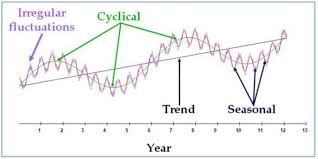
The above graph represents an example of a time series data. To understand the underlying structure in time series, it is broken down into three components; trend, seasonality and noise. These components characterize the pattern and behavior of data over time.
- Trend; This will show the general direction of data whether it is upward(increasing) or downward(decreasing). They indicate long-term movement depicting overall growth or decline. The above chart shows that there was an overall growth(upward trend) over the year
- Seasonality; It is the predictable pattern that appear regularly. In the chart above there is a quarterly rise and drop of values.
- Cycles; represents the fluctuations that don’t have a fixed period.
- Noise; its is the residual variability of data that has no explanations by the factors affecting the trend. The variability is always small compared to the trend and cycle.
Lets use the R inbuilt data set, AirPassengers to decompose the time series data into trend, seasonality …
## [1] 112 118 132 129 121 135# Decompose the air passengers time series
decomposed_ts <- decompose(AirPassengers)
# Plotting will be done later
# decomposed_ts # uncomment to show the dataPractical exercise
In this course, you will be required to download the amazon stock prices prediction data set from here.
Decompose the time series data set into trend, seasonal and residual components.
Solution
library(dplyr)

# Load the data
amazon_stocks <- read.csv("data/amazon_trends.csv")

# Ensure the data is ordered by date (if necessary)
amazon_stocks <- amazon_stocks %>% arrange(Date)

# Convert to time series object
ts_data <- ts(amazon_stocks$Google_Trends, frequency = 365)

# Decompose the time series data
decomposed_data <- decompose(ts_data)

# trend
head(decomposed_data$trend)
## [1] NA NA NA NA NA NA## [1] 5.534740 9.458615 15.172705 21.813409 28.527499 24.314975________________________________________________________________________________
- Visualization of Time Series Data
Visualization is a crucial step in the time series analysis process as it enables;
- the researcher to analyze the important concepts in the data such as trend, seasonality and noise
- the analyst to track perfomance over time
- to diagnose alien behaviors like sudden spikes and presence of outliers
- the analyst to communicate insights to the non-technical stake holders.
Lets visualize the time series data of the AirPassengers.
plot.ts(AirPassengers,
         main = "AirPasengers Time Series ",
        ylab = "Passengers",
        xlab = "Time",
        col = "blue",
        lwd = 2)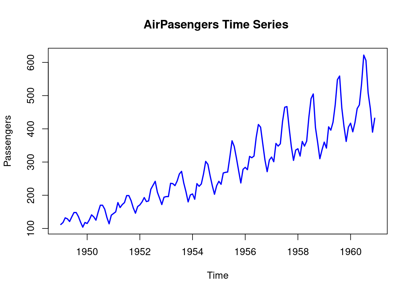
Lets now visualize the decomposed time series.
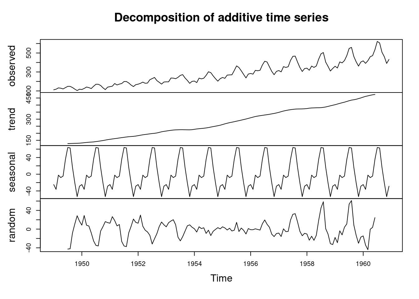
The number of Air Passengers has increased from 1950 to 1960. There is an upward trend. Now lets repeat the process using the ggplot2 library.
# Load the library
library(ggplot2)

# Convert the air passengers to a dataframe
df_airpassengers <- data.frame(
  # Month = as.Date(time(AirPassengers)),  # Extracting the time component
  Month = seq(from = as.Date("1949-01-31"), to = as.Date("1960-12-31"), by = "month"),
  Passengers = as.numeric(AirPassengers) # Extracting the passenger counts
)

head(df_airpassengers)
## Month Passengers
## 1 1949-01-31 112
## 2 1949-03-03 118
## 3 1949-03-31 132
## 4 1949-05-01 129
## 5 1949-05-31 121
## 6 1949-07-01 135# Plot the data
ggplot(df_airpassengers, aes(x = Month, y = Passengers)) +
geom_line(color = "blue", size = 1) + # Line for the time series data
labs(title = "Air Passengers Time Series Data", # Title
x = "Month", # X-axis label
y = "Passengers") + # Y-axis label
theme_minimal() # Apply a minimal theme## Warning: Using `size` aesthetic for lines was deprecated in
## ggplot2 3.4.0.
## ℹ Please use `linewidth` instead.
## This warning is displayed once every 8 hours.
## Call `lifecycle::last_lifecycle_warnings()` to see
## where this warning was generated.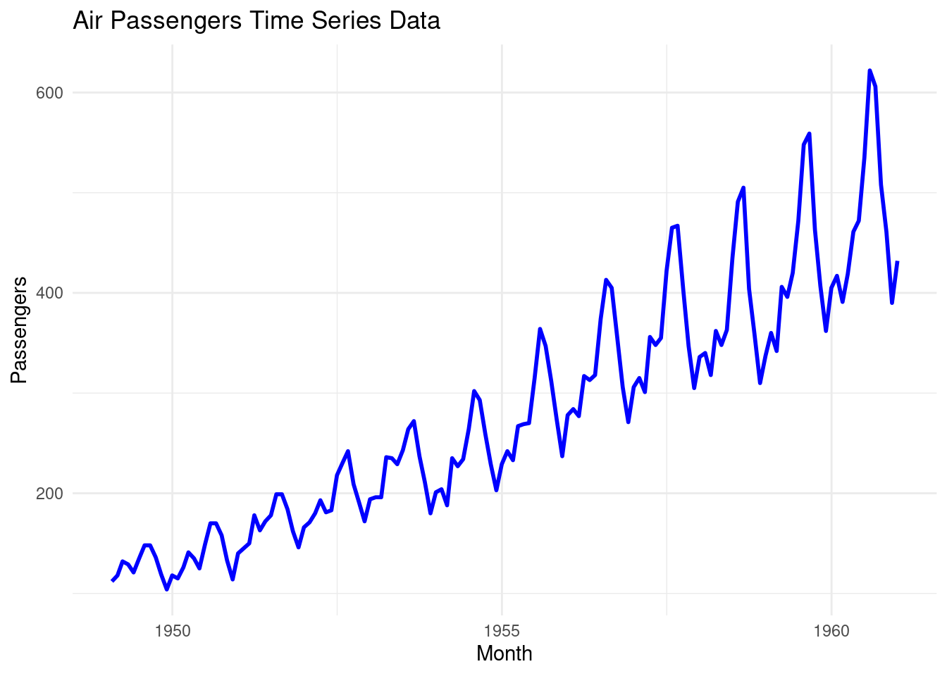
Now lets visualize the decomposed time series (AirPassengers) data using the ggplot2 library;
- create a data frame from the decomposed data
# Create a data frame with all the components
df_decomposed <- data.frame(
  Date = seq(from = as.Date("1949-01-31"), to = as.Date("1960-12-31"), by = "month"),
  Observed = as.numeric(AirPassengers),
  Trend = as.numeric(decomposed_ts$trend),
  Seasonal = as.numeric(decomposed_ts$seasonal),
  Residual = as.numeric(decomposed_ts$random)
)

# Remove the null values
df_decomposed <- na.omit(df_decomposed)

head(df_decomposed)
## Date Observed Trend Seasonal Residual
## 7 1949-07-31 148 126.7917 63.83081 -42.622475
## 8 1949-08-31 148 127.2500 62.82323 -42.073232
## 9 1949-10-01 136 127.9583 16.52020 -8.478535
## 10 1949-10-31 119 128.5833 -20.64268 11.059343
## 11 1949-12-01 104 129.0000 -53.59343 28.593434
## 12 1949-12-31 118 129.7500 -28.61995 16.869949Practical exercise
Using the amazon stock prices prediction data set, plot the data to identify time series patterns and trends
Solution
library(dplyr)
# Load the data
amazon_stocks <- read.csv("data/amazon_trends.csv")
# Ensure the data is ordered by date (if necessary)
amazon_stocks <- amazon_stocks %>% arrange(Date)
# Convert to time series object
ts_data <- ts(amazon_stocks$Google_Trends, frequency = 365)
# Decompose the time series data
decomposed_data <- decompose(ts_data)
# Plot the decomposed data
plot(decomposed_data)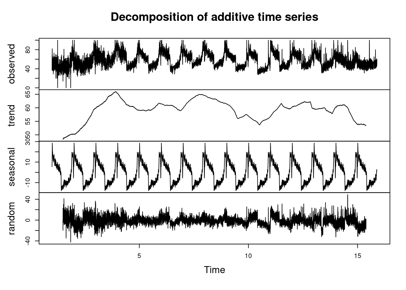 ________________________________________________________________________________
9.3 Basic Time Series Forecasting
9.3.1 Moving Averages
Moving average is a statistical calculations used to analyze values over a specific period of time. Its main focus is to smooth out the short term fluctuations that makes it easier to identify the underlying trends in the data. It smoothens the time series data by averaging the the values over a sliding window.
There are two types of Moving Averages, namely;
- Simple Moving Averages(SMA)
- Weighted Moving Averages (WMA)
Moving Average can also be referred to as the rolling mean. In this course we will demonstrate how to calculate and plot the Simple Moving Average using the rollmean() and filter() functions from the zoo and the Base R respectively.
- Load the required libraries
- Load the data and calulate the moving average using the
rollmean()function. Since the data was collected in monthly basis, a yearly moving average will be calculated.
# Load the AirPassengers dataset
data("AirPassengers")

# Calculate 12-month moving average using rollmean() from zoo package
moving_avg <- rollmean(AirPassengers,
                       k = 12, # 12- Month Moving Average
                       fill = NA)

# Create a data frame combining the original data and moving average
df_airpassengers <- data.frame(
  Month = as.Date(time(AirPassengers)),
  Passengers = as.numeric(AirPassengers),
  MovingAvg = as.numeric(moving_avg)
)

# View the first few rows of the data frame
head(df_airpassengers, 10)
## Month Passengers MovingAvg
## 1 1949-01-01 112 NA
## 2 1949-02-01 118 NA
## 3 1949-03-01 132 NA
## 4 1949-04-01 129 NA
## 5 1949-05-01 121 NA
## 6 1949-06-01 135 126.6667
## 7 1949-07-01 148 126.9167
## 8 1949-08-01 148 127.5833
## 9 1949-09-01 136 128.3333
## 10 1949-10-01 119 128.8333- Now plot the time series data along with the moving average
# Plot original data and moving average
ggplot(df_airpassengers, aes(x = Month)) +
  geom_line(aes(y = Passengers), color = "blue", size = 1) +  # Original data
  geom_line(aes(y = MovingAvg), color = "red", size = 1.2) +  # Moving average
  labs(title = "AirPassengers - Moving Average (12 months)",
       y = "Number of Passengers", x = "Month") +
  theme_minimal()
## Warning: Removed 11 rows containing missing values or values
## outside the scale range (`geom_line()`).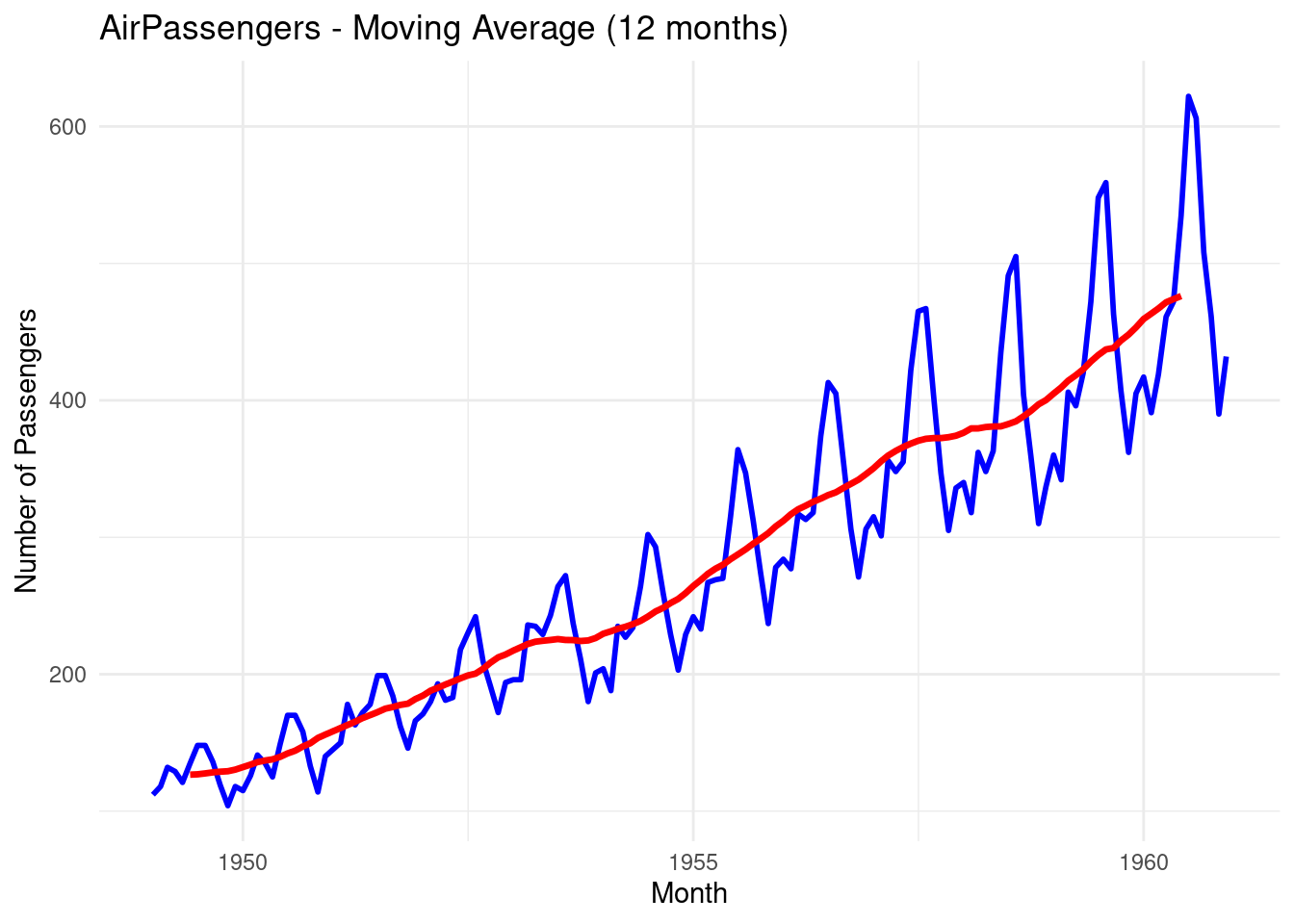
The blue line represents the original time series data
The red line represents the Moving Average data, you can see that the line is smoother.
Let’s repeat the process but this time we use the
filter()function from the Base R. Rememberdplyralso hasfilter()function. To speficify usestats::filter().
# Calculate the Moving Average
moving_avg_filter <- stats::filter(AirPassengers, rep(1/12, 12), sides = 2)

# Add the moving average to the existing data frame
df_airpassengers$MovingAvg_Filter <- as.numeric(moving_avg_filter)

# Plot original data and moving average calculated by filter()
ggplot(df_airpassengers, aes(x = Month)) +
  geom_line(aes(y = Passengers), color = "blue", size = 1) +  # Original data
  geom_line(aes(y = MovingAvg_Filter), color = "green", size = 1.2) +  # Moving average from filter
  labs(title = "AirPassengers - Moving Average (12 months, filter())",
       y = "Number of Passengers", x = "Month") +
  theme_minimal()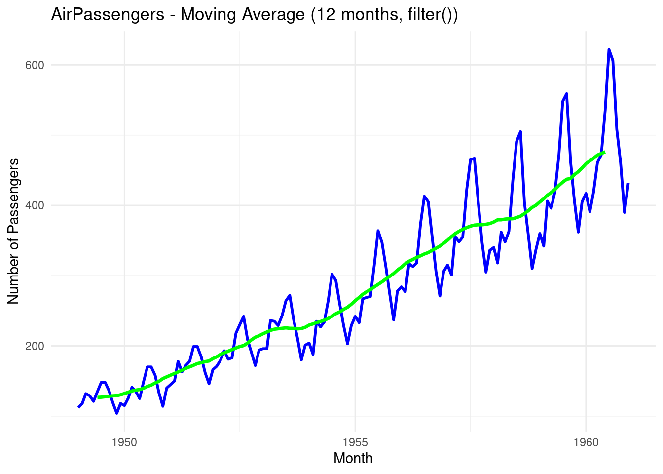
- The green line represents the simple moving average over a 12-month sliding window
Practical exercise
Apply 30-day moving averages on the amazon stock.
Solution
library(dplyr)
library(zoo)
library(ggplot2)

# Load the data
amazon_stocks <- read.csv("data/amazon_trends.csv")

# Ensure the 'Date' column is in Date format
amazon_stocks$Date <- as.Date(amazon_stocks$Date, format = "%Y-%m-%d")  # Adjust format as per your dataset

# Ensure the data is ordered by date (if necessary)
amazon_stocks <- amazon_stocks %>% arrange(Date)

# Calculate 30-day moving average
amazon_stocks <- amazon_stocks %>%
  mutate(moving_avg_30 = rollmean(Google_Trends, k = 30, fill = NA))

# Plot the original data and moving average
ggplot(amazon_stocks, aes(x = Date)) +
  geom_line(aes(y = Google_Trends, color = "Original"), size = 1) +
  geom_line(aes(y = moving_avg_30, color = "30-Day Moving Avg"), size = 1) +
  labs(title = "Stock Price with 30-Day Moving Average",
       x = "Date", y = "Stock Price") +
  scale_color_manual(values = c("Original" = "blue", "30-Day Moving Avg" = "red")) +
  theme_minimal() +
  theme(legend.title = element_blank())
## Warning: Removed 29 rows containing missing values or values
## outside the scale range (`geom_line()`).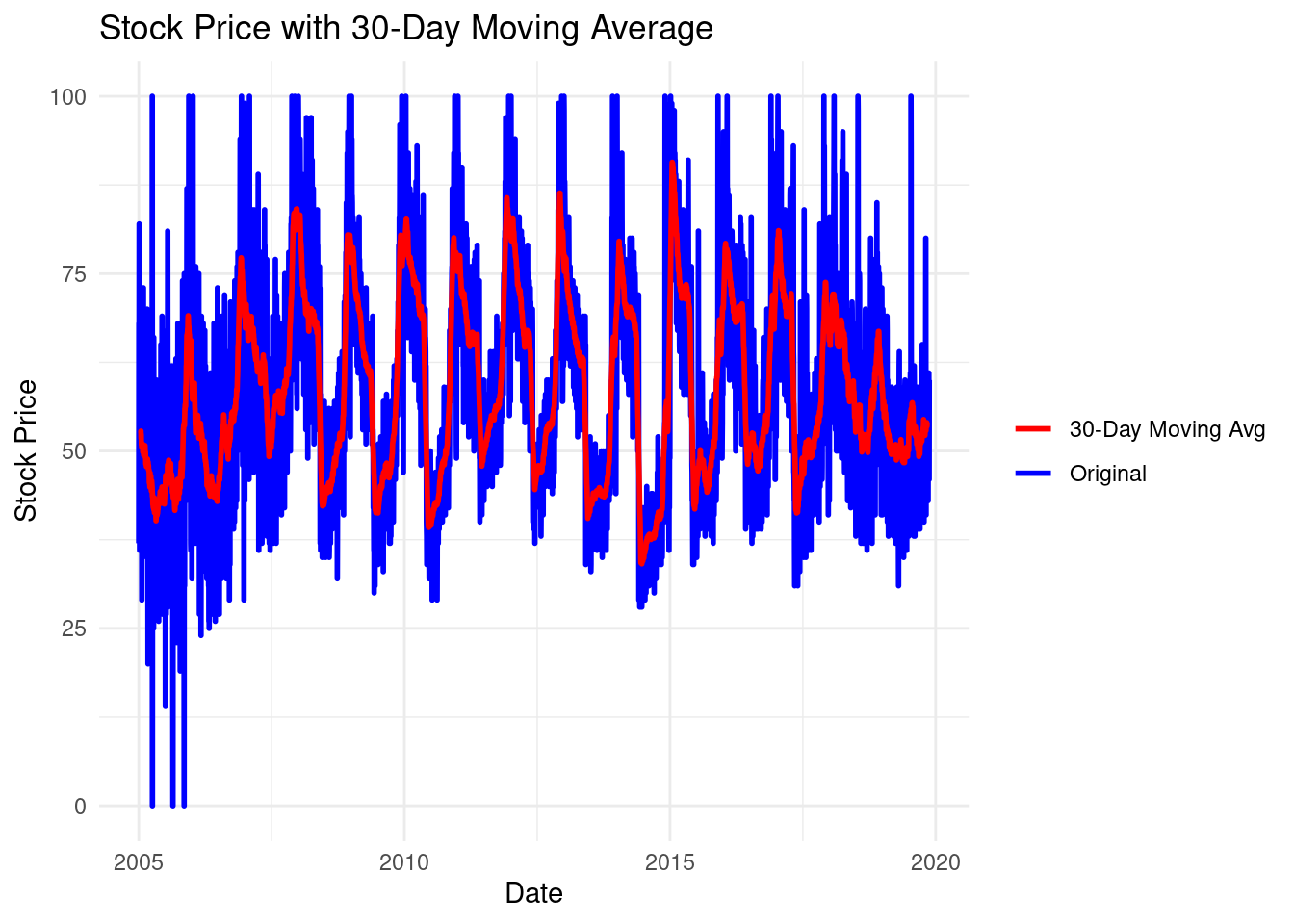
________________________________________________________________________________
9.3.2 ARIMA model
ARIMA stands for AutoRegressive Integrated Moving Average that is defined in three parameters namely; p, d and q where;
- AR(p) Autoregression: This utilizes the relationship between the current values and the previous one where the current ones are dependent on the previous.
- I(d) Integration: It entails subtracting the current observations of a series with its previous values
dnumber of times. This is done to make the time series stationary. - MA(q) Moving Average: A model that uses the dependency between an observation and a residual error from a moving average model applied to lagged observations. A moving average component depicts the error of the model as a combination of previous error terms. The order q represents the number of terms to be included in the model
In summary, p, d and q represents the number of autoregressive (AR) terms, the number of differences required to make the series stationary and the number of moving averages(MA) respectively. These values are determined using the following diagonstic tools;
- Autocorrelation Function(ACF): identifies the MA terms
- Partial Autocorrelation Function (PACF): identifies the number of AR terms.
- Differencing: determines the value of
dneed to make the series stationary.
R has auto.arima() function from the forecast library designed to create the ARIMA model.
The forecast library can be installed by;
install.packages("forecast")Lets use the AirPassengers data to design our ARIMA model.
Step 1: Check stationarity
To create an ARIMA model the time series data, in this case the AirPassengers, must be stationary i.e have a constant mean and variance. Otherwise, differencing is applied to make it stationary. The diff() is used to this.
## Registered S3 method overwritten by 'quantmod':
##   method            from
##   as.zoo.data.frame zoo
# Load the AirPassengers data set if not loaded already
# Make the data stationary by differencing
diff_passengers <- diff(log(AirPassengers))Step 2: Use the ACF and PACF Plots to Identify ARIMA Parameters
The ACF is used to find the correlation between the time series and the lagged versions((previous) of itself. Thats the
q(MA) parameter.The PACF finds the correlation between the time series and the lagged versions of itself but after removing the effect of the intermediate lags. Thats the
p(AR) parameter
Step 3: Plot the ACF and PACF
The acf() and pacf functions are used to generate the plots.
# Plot the ACF and PACF of the differenced data
par(mfrow = c(1, 2))  # Set up for side-by-side plots

# ACF plot
acf(diff_passengers, main = "ACF of Differenced AirPassengers")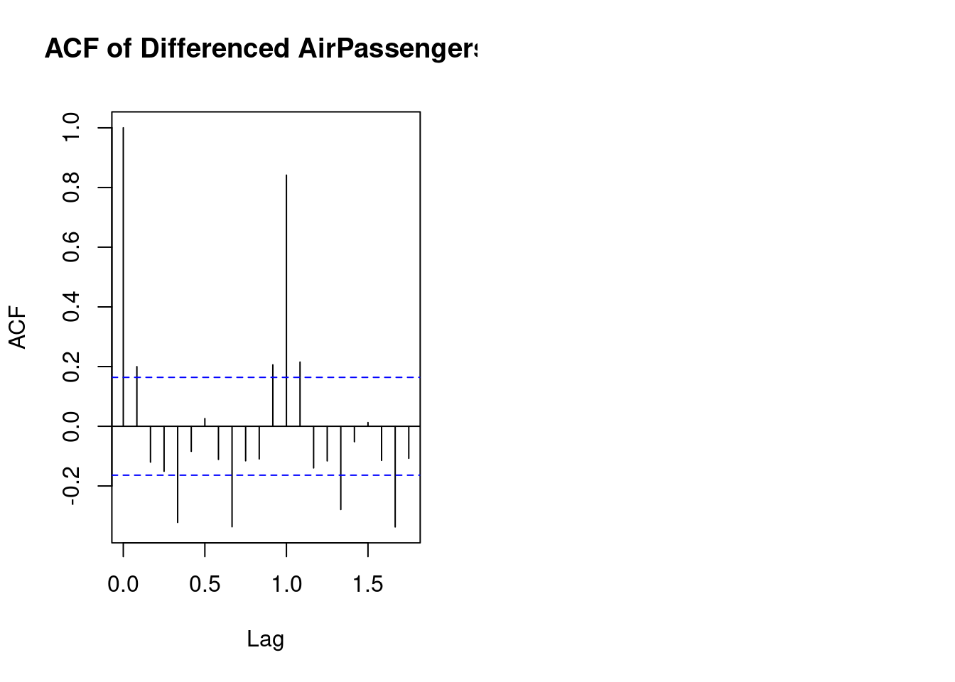
The ACF (Autocorrelation Function) plot for the AirPassengers data set typically shows significant positive autocorrelations for several lags, which indicates that the series has a strong trend and seasonal patterns.
Key points to interpret from the ACF plot:
- High autocorrelation at early lags: The first few lags (e.g., 1 to 12) likely show high autocorrelation, which suggests a strong seasonal pattern in the data (monthly seasonality in this case).
- Gradual decline: The ACF values decrease slowly, indicating the presence of a long-term trend in the data.
- Seasonality: Peaks in the autocorrelations at lags of multiples of 12 (e.g., 12, 24) indicate the annual cycle in the data, which is typical for monthly time series with yearly seasonality.
Overall, this suggests that the AirPassengers data exhibits both trend and seasonality, which is important for selecting an appropriate time series model
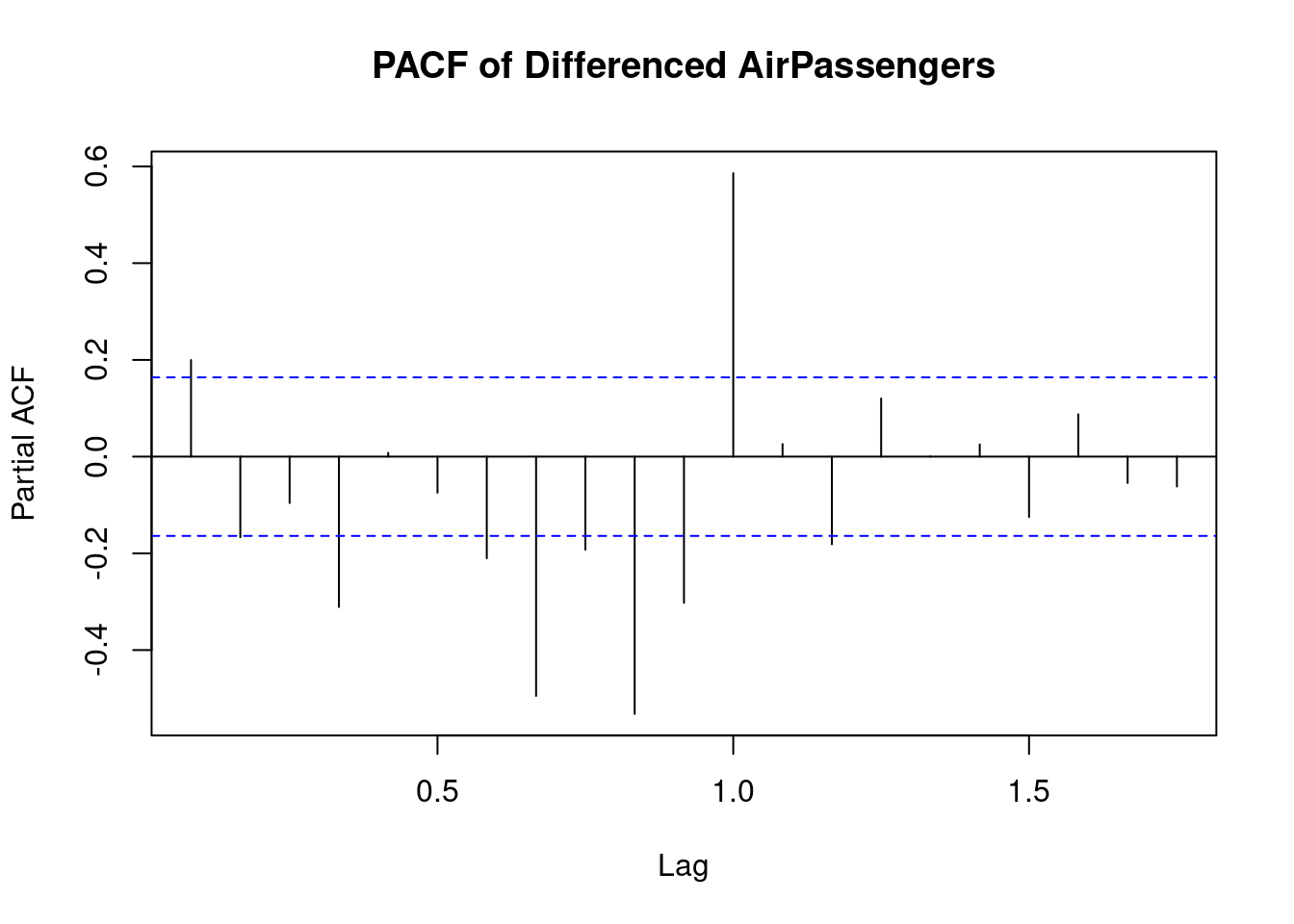
The PACF (Partial Autocorrelation Function) plot for the differenced AirPassengers data set indicates the following:
- Significant PACF at Lag 1: There is a strong spike at lag 1, which suggests that after differencing, the time series still has a significant short-term autocorrelation at this lag. This can imply that an AR(1) model might be suitable.
- Seasonal Pattern: The spike at lag 12 suggests the presence of a seasonal component in the data with a yearly cycle. This is consistent with the monthly nature of the
AirPassengersdata set and the yearly repeating patterns in air travel. - Dampening beyond Lag 1: After the significant spike at lag 1, the PACF values quickly decline, with some negative values at higher lags, indicating that the differenced series has removed much of the autocorrelation present in the original data.
In summary, this plot suggests a time series with strong short-term (lag 1) autocorrelation and seasonal effects that are likely at yearly intervals (lag 12). Based on this, you could consider using an ARIMA model with seasonal components to better model the behavior of the data.
The AirPassengers data set is not stationary, therefore the data will be transformed by log-transform before applying differencing
# Log transformation to stabilize variance
log_passengers <- log(AirPassengers)

# Difference the log-transformed data to make it stationary
diff_passengers <- diff(log_passengers)

# Plot the differenced series to check stationarity
plot(diff_passengers, main = "Differenced Log of AirPassengers", ylab = "Differenced Log(Passengers)", xlab = "Time")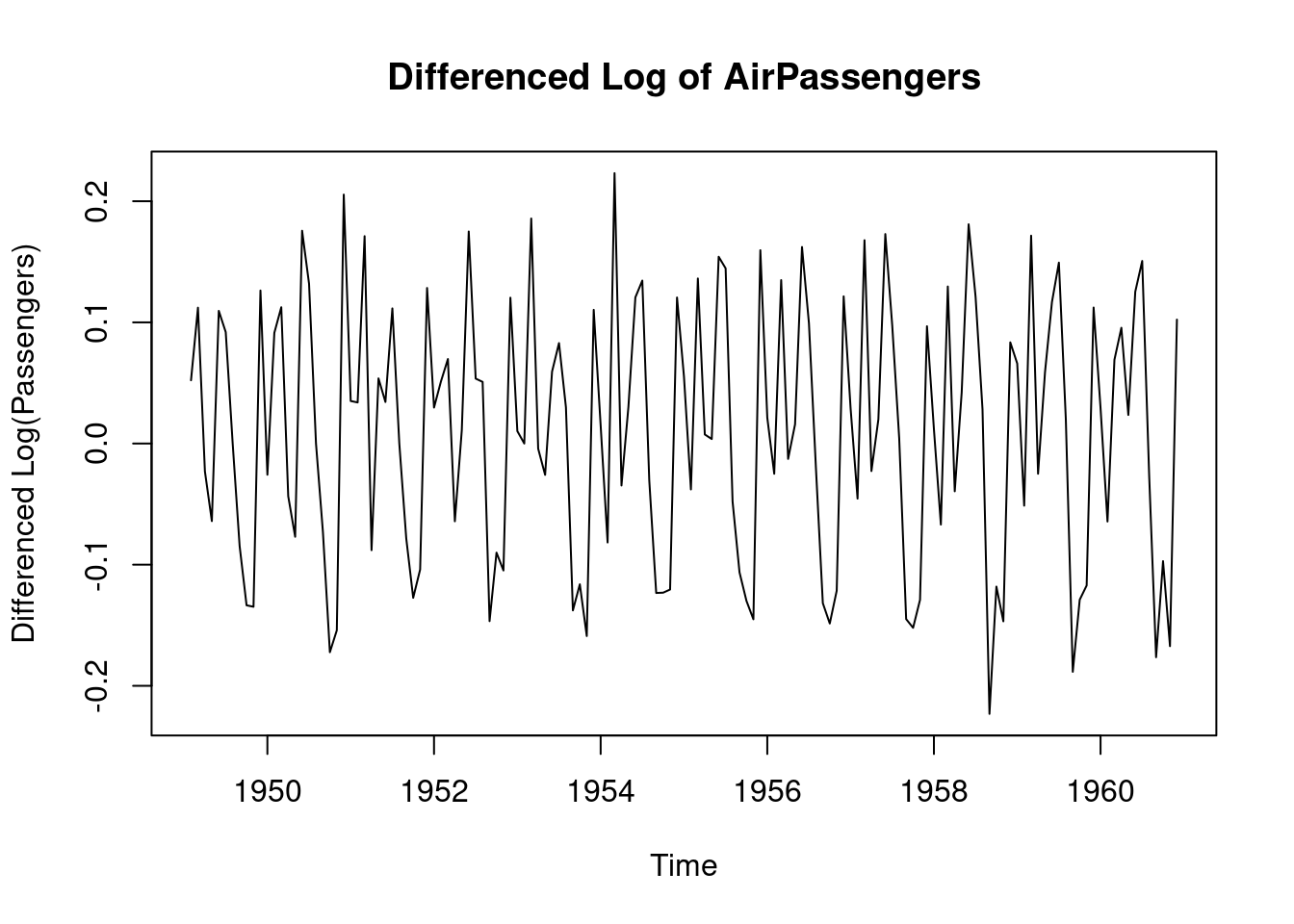
Step 4: Fit the ARIMA model
The auto.arima() function can be used to automate the process of selecting the p, d, q parameters.
# Auto-identify ARIMA parameters and fit the model
fit_arima <- auto.arima(log_passengers)

# Display the summary of the fitted ARIMA model
summary(fit_arima)
## Series: log_passengers
## ARIMA(0,1,1)(0,1,1)[12]
##
## Coefficients:
## ma1 sma1
## -0.4018 -0.5569
## s.e. 0.0896 0.0731
##
## sigma^2 = 0.001371: log likelihood = 244.7
## AIC=-483.4 AICc=-483.21 BIC=-474.77
##
## Training set error measures:
## ME RMSE MAE MPE MAPE MASE
## Training set 0.0005730622 0.03504883 0.02626034 0.01098898 0.4752815 0.2169522
## ACF1
## Training set 0.01443892Lets fit the ARIMA model with of order 1 1 1 to represent p d q respectively.
# Fit ARIMA(1,1,1) model
fit_manual_arima <- arima(log_passengers, order = c(1, 1, 1))

# Display the summary of the fitted ARIMA model
summary(fit_manual_arima)
##
## Call:
## arima(x = log_passengers, order = c(1, 1, 1))
##
## Coefficients:
## ar1 ma1
## -0.5780 0.8482
## s.e. 0.1296 0.0865
##
## sigma^2 estimated as 0.01027: log likelihood = 124.31, aic = -242.63
##
## Training set error measures:
## ME RMSE MAE MPE MAPE MASE
## Training set 0.008294478 0.1009741 0.08585615 0.1401158 1.557282 0.9477905
## ACF1
## Training set 0.010984Step 5: Forecast with the ARIMA model
The fitted ARIMA model can now be used for forecasting the future values using the arima() function.
# Forecast for the next 24 months (2 years)
forecast_arima <- forecast(fit_arima, h = 24)

# Plot the forecast
plot(forecast_arima, main = "ARIMA Forecast for AirPassengers", xlab = "Time", ylab = "Log(Passengers)")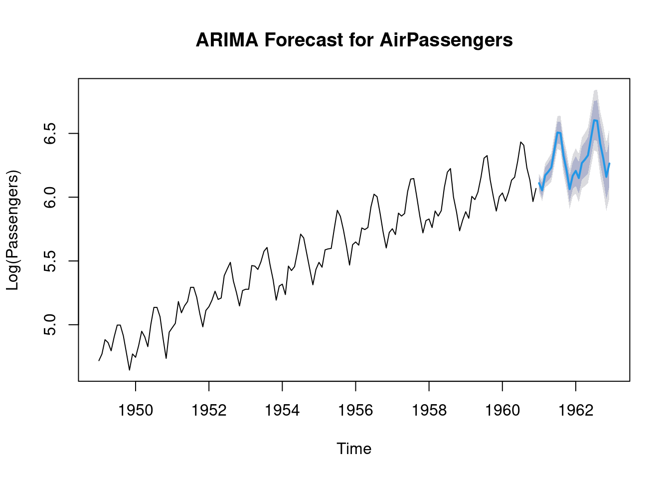
The blue part of the plot represents the forecasted values.
Practical exercise
Fit the ARIMA model to the Amazon Stock Prices Prediction data and interpret the results.
Solution
Load the data
# Load the data
amazon_stocks <- read.csv("data/amazon_trends.csv")

# Ensure the 'Date' column is in Date format
amazon_stocks$Date <- as.Date(amazon_stocks$Date, format = "%Y-%m-%d")  # Adjust format as per your data set
Make the data stationary by differencing
# Apply log and differencing only on the stock prices
diff_amazon_stocks <- amazon_stocks %>%
  dplyr::mutate(Google_Trends_Diff = c(NA, diff(log(Google_Trends), lag = 1))) %>%
  dplyr::select(Date, Google_Trends_Diff)

# Optionally, you can still choose to remove the first row with NA
diff_amazon_stocks <- diff_amazon_stocks[-1, ]
Plot the ACF and PACF to identify ARIMA parameters but Inspect the data for NA, Inf, or NaN values first
# Check for NA or infinite values in the differenced data
sum(is.na(diff_amazon_stocks$Google_Trends_Diff))  # Count NA values
## [1] 0## [1] 6# Remove NA and Inf values
diff_amazon_stocks_clean <- diff_amazon_stocks %>%
filter(!is.na(Google_Trends_Diff) & !is.infinite(Google_Trends_Diff))
# Plot the ACF and PACF
par(mfrow = c(1, 2), mar = c(4, 4, 2, 1)) # Adjust margins
# ACF plot
acf(diff_amazon_stocks_clean$Google_Trends_Diff, main = "ACF of Differenced Stock Prices")
# PACF plot
pacf(diff_amazon_stocks_clean$Google_Trends_Diff, main = "PACF of Differenced Stock Prices")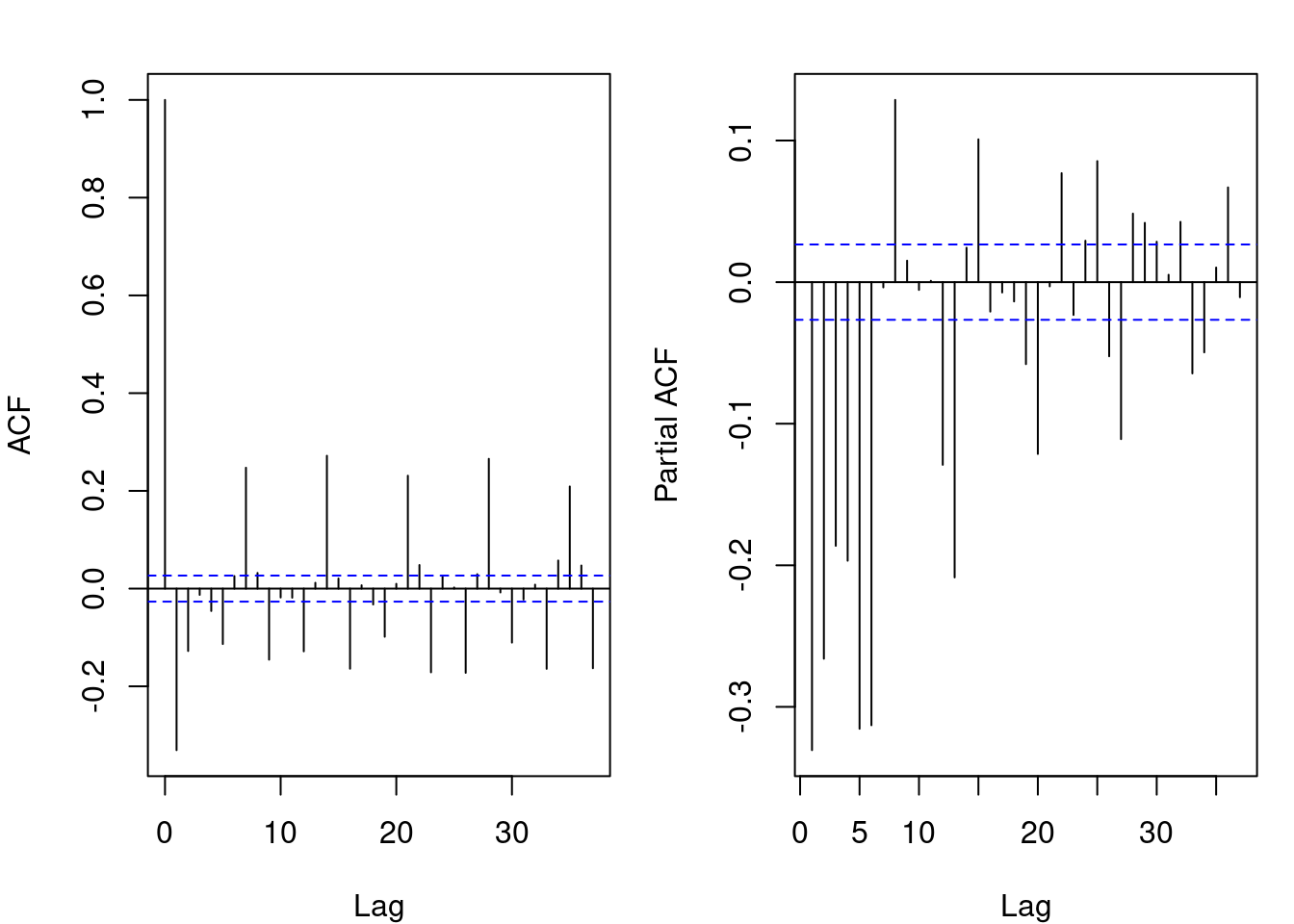
ACF (Autocorrelation Function) Plot: there are a few significant spikes at the first few lags, and then it quickly diminishes and remains near zero for subsequent lags. This suggests that the time series is stationary after differencing, with little autocorrelation remaining beyond the first few lags. The significant spikes at the beginning could indicate some short-term correlation, but overall, the series does not exhibit strong autocorrelation at higher lags
PACF (Partial Autocorrelation Function) Plot: a few significant spikes, especially at very early lags, but then it quickly dies down. This indicates that the differenced time series has a small number of significant partial autocorrelations, suggesting that an AR (Auto-Regressive) model of low order (e.g., AR(1) or AR(2)) might be sufficient to model the series.
Both the ACF and PACF plots both indicate that the series has become stationary after differencing. The ACF plot suggests that there is no significant long-term autocorrelation in the data while the PACF plot shows that an AR process of a low order (possibly AR(1)) may explain most of the autocorrelation in the data.
________________________________________________________________________________
9.4 Hands-On Exercises
You will be required to download the Electricity Price & Demand 2018-2023 data set from here
Perform time series on the total demand on one of the csv files provided from visualization to forecasting
Solution
##
## ######################### Warning from 'xts' package ##########################
## #                                                                             #
## # The dplyr lag() function breaks how base R's lag() function is supposed to  #
## # work, which breaks lag(my_xts). Calls to lag(my_xts) that you type or       #
## # source() into this session won't work correctly.                            #
## #                                                                             #
## # Use stats::lag() to make sure you're not using dplyr::lag(), or you can add #
## # conflictRules('dplyr', exclude = 'lag') to your .Rprofile to stop           #
## # dplyr from breaking base R's lag() function.                                #
## #                                                                             #
## # Code in packages is not affected. It's protected by R's namespace mechanism #
## # Set `options(xts.warn_dplyr_breaks_lag = FALSE)` to suppress this warning.  #
## #                                                                             #
## ###############################################################################
##
## Attaching package: 'xts'## The following objects are masked from 'package:data.table':
##
## first, last## The following objects are masked from 'package:dplyr':
##
## first, lastLoad the data set
##   REGION      SETTLEMENTDATE TOTALDEMAND  RRP PERIODTYPE
## 1   NSW1 2023/06/01 00:05:00     7953.04 90.2      TRADE
## 2   NSW1 2023/06/01 00:10:00     7967.67 90.2      TRADE
## 3   NSW1 2023/06/01 00:15:00     7923.89 90.2      TRADE
## 4   NSW1 2023/06/01 00:20:00     7907.81 90.2      TRADE
## 5   NSW1 2023/06/01 00:25:00     7855.31 90.2      TRADE
## 6   NSW1 2023/06/01 00:30:00     7880.03 90.2      TRADE
Ensure the Date is in POSIXct format to include minutes.
df <- df %>%
  mutate(DATE = as.POSIXct(SETTLEMENTDATE, format = "%Y/%m/%d %H:%M:%S")) %>%
  arrange(DATE)  # Sort by date
Create an xts object with five minute frequency since the date time has a five minute difference and xts automatically handles that granularity
##
## 1 function (x = NULL, order.by = index(x), frequency = NULL, unique = TRUE,
## 2     tzone = Sys.getenv("TZ"), ...)
## 3 {
## 4     if (is.null(x) && missing(order.by))
## 5         return(.xts(NULL, integer()))
## 6     if (!timeBased(order.by))
Fill any missing 5-minute intervals by forward-filling data
regular_df_xts <- merge(df_xts, zoo(, seq(start(df_xts), end(df_xts), by = "5 min")), fill = na.locf)Convert the xts back to ts for decomposition and let’s assume your time series starts at 1 and has a frequency of 288 (5-minute intervals in a day: 60/5 * 24 = 288)
df_ts <- ts(as.numeric(regular_df_xts), frequency = 288)

# Decompose the time series using STL (Seasonal-Trend decomposition)
decomposed_df_ts <- stl(df_ts, s.window = "periodic")

# Plot the decomposition
plot(decomposed_df_ts)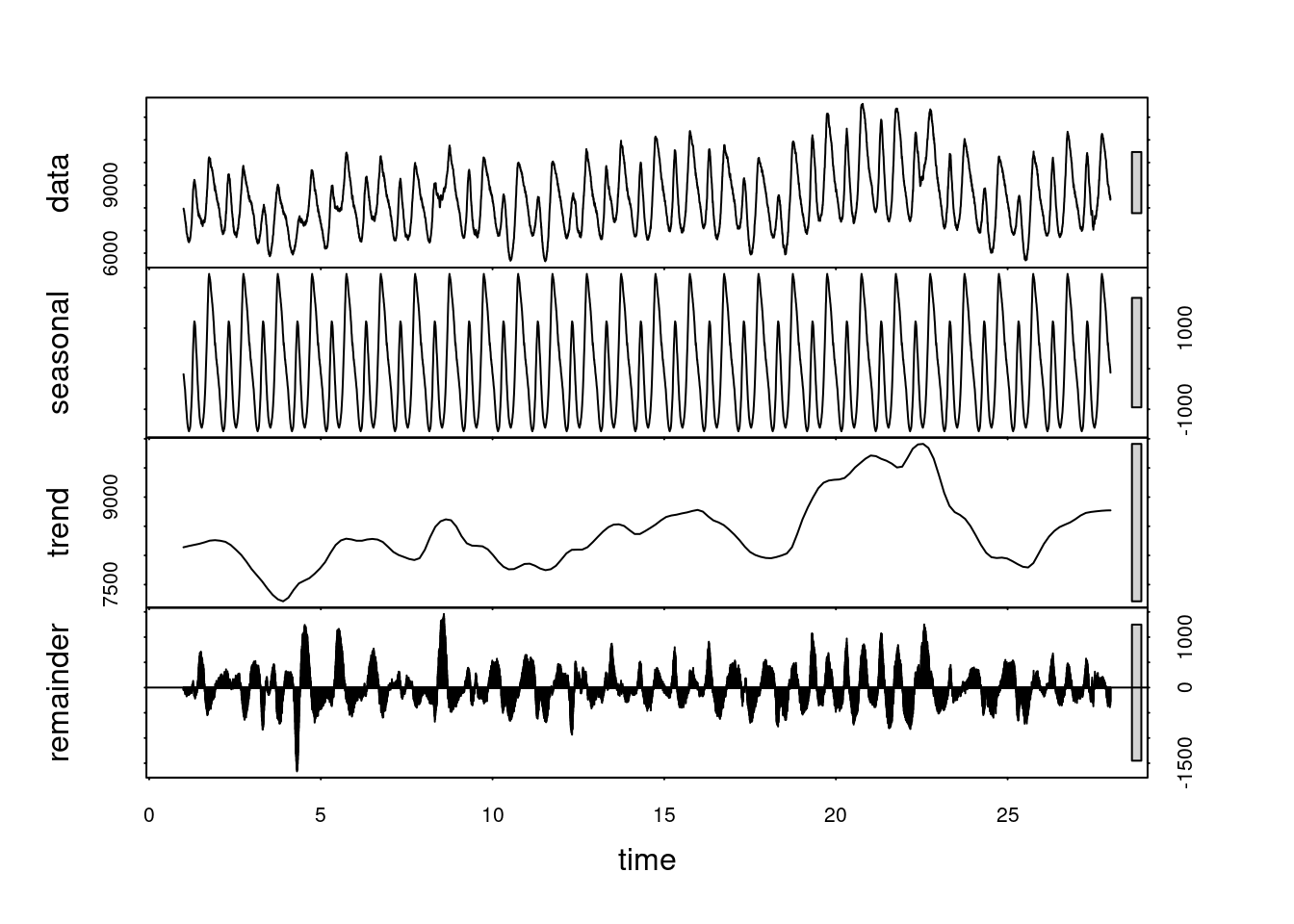
The decomposition plot of the time series shows four key components:
- Observed Data (Top Panel): This represents the original time series data. The fluctuations seen here correspond to variations in the stock prices over time.
- Seasonal Component (Second Panel): This captures regular, repeating patterns (seasonality) within the data. We see clear oscillations that repeat over time, indicating that the stock prices follow a consistent seasonal pattern, likely corresponding to periodic market behaviors (e.g., intra-day or weekly patterns).
- Trend Component (Third Panel): The trend line reveals the long-term movement of the stock prices. Here, we observe that the overall stock price is decreasing, increasing slightly, and then stabilizing toward the latter part of the series, reflecting underlying trends in the data.
- Residuals (Bottom Panel): These represent the noise or random fluctuations in the data after accounting for the trend and seasonality. The residuals are mostly centered around zero, indicating that the model captures much of the pattern, with some random noise still present.
In summary, the decomposition shows that the stock data has a clear seasonal component, an overall trend with some fluctuations, and residual noise.
________________________________________________________________________________