Chapter 4 CORRELATION, COVARIANCE, GEOSTATISTICS
4.1 INTRODUCTION
In this topic, we will focus on Bivariate correlation and multivariate correlation, that is, the correlation between two or multiple variables.
Lets define correlation once again! Correlation is the degree if association of variables.
Correlation coefficient: is the quantifier that indicates the association of variables whether whether one variable is increasing/decreasing and the other one is increasing/decreasing or if there is no association at all. The correlation coefficient always ranges from -1 to 1 where the closer it gets to +1 means a stronger positive correlation(both variables increases/decreases at a concert) while it gets closer to -1 means a stronger negative correlation where one variable increases and the other variable decreases. A correlation close to zero from any direction(\(+_{ve}\) or \(-_{ve}\)) shows that there is little to no correlation between variables.
Multiple correlation is where a group of variables (usually referred to as the predictor or X variables) to jointly relate to another variable (usually referred to as the response or Y variable),
Partial correlation is the correlation between any pair of variables, given the presence of the remaining variables.
There are several methods to compute the correlation coefficient;
- Pearson’s correlation coefficient. - satisfies linearity, normality and other parametric assumptions test.
- Spearman’s correlation coefficient. - free from linearity, normality etc. conditions.
- Kendall’s correlation coefficient. - free from linearity, normality etc conditions.
4.2 CORRELATION AND COVARIANCE
Remember, Correlation is the degree of association between two variables - and the strength and direction of this relationship is captured by the correlation coeeficient which quantifies how the variables are related.
Correlation can be linear or non-linear where the former refers to the proportional changes in variables(e.g doubling of one variables results in doubling the other) while the later refers to the relationship being not proportional(e.g doubling resulting into triple or fourfold change of the other).
While correlation does not imply causation, understanding correlations can provide valuable insights. For example, a correlation between soil pH and aluminum levels in groundwater might indicate that lower pH levels increase aluminum dissolution, even though pH itself is not the direct cause of aluminum contamination.
Covariance, on the other hand, measures the degree to which two variables change together. Unlike the correlation coefficient, covariance lacks a standardized scale, making it harder to interpret. The correlation coefficient can be derived by dividing the covariance by the product of the standard deviations of the two variables.
Application of correlation
Correlation forms the foundation for many analyses, including regression, where relationships are used to predict one variable based on another. However, spurious correlations (associations without logical explanation) should be critically evaluated to avoid misleading conclusions. For instance, a correlation between the number of graduating students and basketball game wins is likely coincidental rather than meaningful.
In Summary, correlation provides a normalized measure of association, covariance gives an absolute value of joint variability. Together, these metrics are crucial for understanding relationships between variables and guiding further analyses.
Lets dive deep into exploring the correlation coefficient mentioned in the introduction.
4.2.1 Pearson’s Correlation Coefficient
Pearson’s correlation coefficient, often referred to as Pearson’s r or the product-moment correlation, measures the strength and direction of a linear relationship between two variables. It works best for linear and monotonic relationships, where the association is consistently positive or negative.
A high pearson correlation will have the data points when plotted on a scatter plot to align in a straight line and have all points easily predicted/approximated by a straight line(“regression line”).
Pearson correlation is computed when the test or data satisfies the parametric assumptions, such that;
- Be from normally distributed populations.
- Have no significant outliers.
- Show consistent variance (homoscedasticity).
This type of correlation is sensitive to non-linear data or data containing missing values(e.g non-detects). Under such cases alternatives like Spearman or Kendall coefficients are recommended.
The Pearsons correlation coeefficient is:
\[r = {1\over{n - 1}}{\sum^n_{i=1}[{{x_i - \overline{x}}\over{s_x}}][{{y_i - \overline{y}}\over{s_y}}]}\]
Where;
- \(x_i\): the independent variable data value
- \(\overline x\): the mean of independent data values
- \(y_i\): the dependent variable data value
- \(\overline y\): the mean of the dependent data values
- \(s_x\): The standard deviation of the independent variable
- \(s_y\): the standard deviation of the dependent variable
ALternatively, it can be calculated as;
\[r = {{\sum(x_i - \overline x)(y_i- \overline y)}\over{\sqrt{\sum{(x_i - \overline x)^2(y_i - \overline y)^2}}}}\]
Where;
- \(x_i\) and \(y_i\): the data values for the two variables
- \(\overline x\) and \(\overline y\): the mean values of the variables.
If r’s magnitude is;
- 0.95 and above, this indicates a strong correlation.
- between 0.75 and below 0.95 , indicates a moderate correlation.
- below 0.5, therefore there is a weak correlation.
Significance Testing for Pearson’s Correlation Coefficient
When working with real-world ecological data like the release of acidity of agricultural farms near zero grazing structures, significance testing helps determine whether the observed correlation between two variables in a sample reflects a true correlation in the population or is simply due to chance.
Here is a step by step process;
- Forumalate the null hypothesis
Null hypothesis (\(H_0\)): There is no correlation between the two variables in the population (r = 0)
Alternate Hypothesis(\(H_a\)): There is a strong correlation
- Compute the test statistic
Test statistic (\(t_r\)) can be computed by;
\[t_r = {{r\sqrt{n-2}}\over{\sqrt{1-r^2}}}\]
Where;
- \(r\): Sample correlation coefficient
- \(n\): Number of paired data points
This formula adjusts \(r\) for the sample size and expresses how extreme the observed correlation is.
- Compute the degree of freedom
The degree of freedom is calculated by; \[df = n -2 \]
- Determine the critical value, pvalue and make your decision.
Try it!
Lets have a practice on an ecological problem. we’ll utilize the Forest Health and Ecological Diversity data set, which offers a comprehensive collection of ecological and environmental measurements focused on tree characteristics and site conditions. This data set is publicly available on Kaggle. Download it from here. First lets perform a pearson correlation to measure the linear relationship between two continuous variables.
In this case we will focus on the tree height(Tree_Height) versus Diameter at breast height(DBH).
# Load the required libraries
library(ggplot2)

# Load the required data set
forest_data <- read.csv("data/forest_health/forest_health_data.csv")

# Compute Pearson’s correlation coefficient
pearson_corr <- cor(forest_data$Tree_Height, forest_data$DBH, method = "pearson", use = "complete.obs")
print(pearson_corr)
## [1] -0.01355993# Visualize correlation
ggplot(forest_data, aes(x = DBH, y = Tree_Height)) +
geom_point() +
geom_smooth(method = "lm", col = "blue") +
labs(title = "Scatter Plot of Tree Height vs. DBH", x = "DBH", y = "Tree Height")## `geom_smooth()` using formula = 'y ~ x'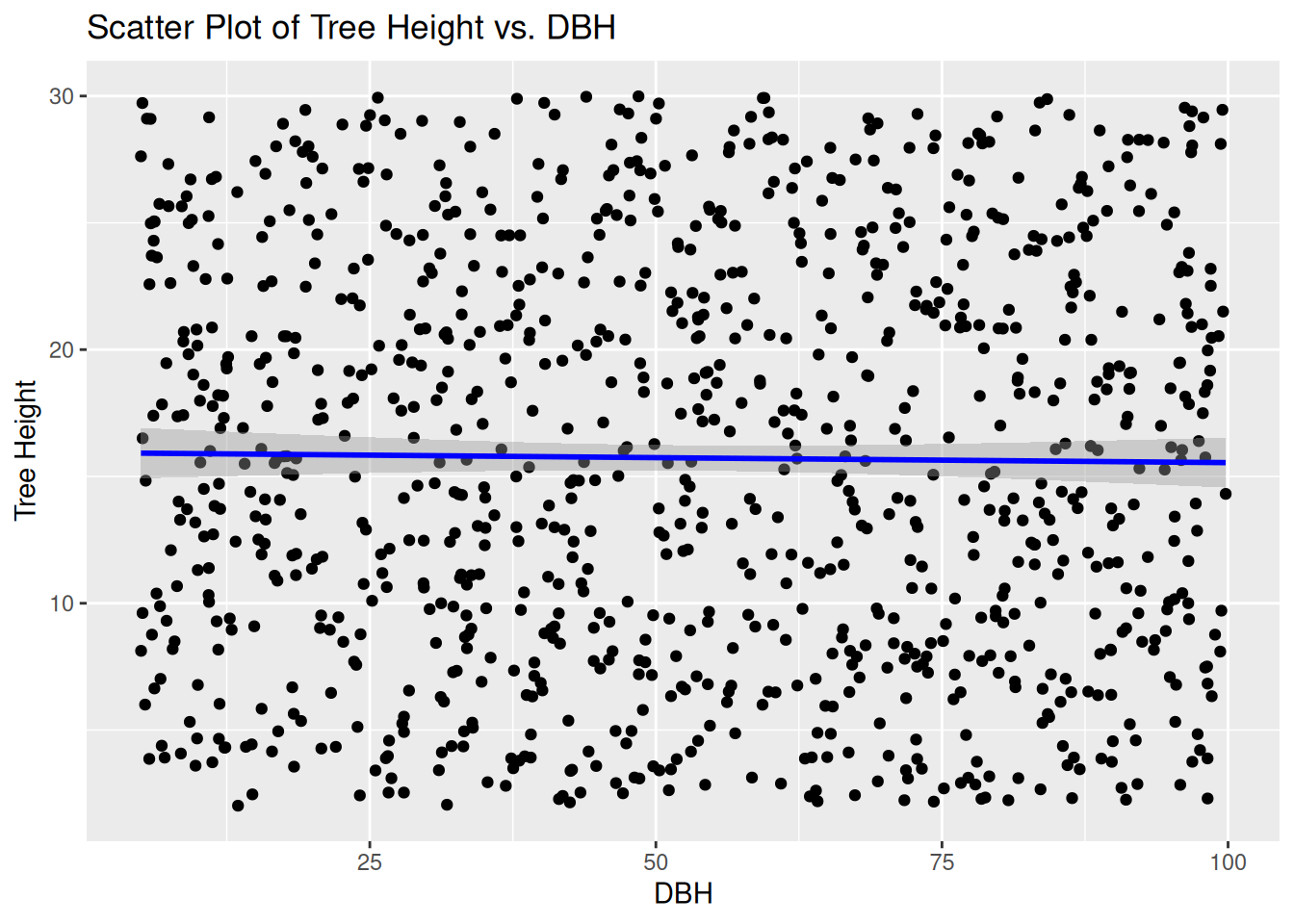
The Pearson’s correlation coefficient is nearly 0 and the scatter plot along with the regression line shows no sign of linear relationship. This shows that there is little to no relationship between Diameter at Breast height and height of the tree itself in the forest
Practical Exercise
Examine whether there is a correlation between CO2 and Greenhouse Gas Emissions. You will download the co2_greenHouseGas_Emissions.csv file from here
Solution
# Load libraries
library(dplyr)
library(ggplot2)

# Load the data set and calculate pearson correlation
data <- read.csv("data/co2_greenHouseGas_Emissions.csv")

# Select the required columns
selected_df <- data %>%
  select(CO2.Emissions..Mt., Greenhouse.Gas.Emissions..Mt.)

# Convert values to numeric
selected_df$CO2.Emissions..Mt. <- as.numeric(selected_df$CO2.Emissions..Mt.)
## Warning: NAs introduced by coercion## Warning: NAs introduced by coercion# Remove null values
selected_df <- na.omit(selected_df)
# Compute Pearson correlation coefficient
correlation <- cor(selected_df$CO2.Emissions..Mt., selected_df$Greenhouse.Gas.Emissions..Mt.,
method = "pearson")
# Print correlation result
print(paste("Pearson Correlation Coefficient:", round(correlation, 3)))## [1] "Pearson Correlation Coefficient: 0.72"# Visualize relationship using scatter plot with regression line
ggplot(selected_df, aes(x = CO2.Emissions..Mt., y = Greenhouse.Gas.Emissions..Mt.)) +
geom_point(color = "blue") +
geom_smooth(method = "lm", color = "red", se = FALSE) +
labs(title = "Relationship Between CO₂ Emissions and total Greenhouse gases",
x = "CO₂ Emissions (Million Metric Tons)",
y = "Total Greenhouse gases") +
theme_minimal()## `geom_smooth()` using formula = 'y ~ x'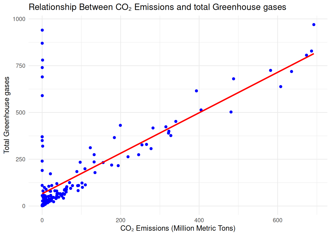
________________________________________________________________________________
4.2.2 Spearman’s and Kendall’s Correlaton Coefficients
In ecological studies, researchers often analyze relationships between variables that may not follow normal distributions or linear trends. Nonparametric correlation methods like Spearman’s Rho (\(\rho\)) and Kendall’s Tau (\(\tau\)) are particularly useful in such scenarios. These methods allow for the exploration of monotonic relationships—either linear or nonlinear—without relying on strict parametric assumptions.
4.2.2.1 Spearman’s Rho(\(\rho\))
Spearman’s Rho is commonly used in ecology to measure how two variables, such as species abundance and habitat quality, vary together in a monotonic fashion.
Key Features and Calculations
- Data Ranking:
- Rank the values of one variable (e.g., habitat quality) from smallest to largest.
- Repeat the ranking process for the second variable (e.g., species abundance).
- Rank Alignment:
Rearrange the ranks of the second variable to match the order of the first variable’s values.
These ranks replace the original data values in the formula used for Pearson’s correlation coefficient. This approach ensures that outliers, which can significantly distort parametric methods, have minimal impact. The test of significance for Spearman’s Rho follows the same process as that for Pearson’s coefficient, using the ranked data instead of raw values. While Spearman’s method is robust and flexible, it does not utilize the full magnitude of the data values, making it less precise than Pearson’s method when the assumptions for Pearson’s coefficient are satisfied
4.2.2.2 Kendall’s Tau (\(\tau\))
Kendall’s Tau offers another rank-based approach to measure monotonic relationships and is particularly relevant for ecological data with small sample sizes or irregular distributions.
Key Features and Calculations
Here is how Kendall’s Tau is calculated;
- Sorting and Matching: Sort one variable (e.g., elevation) in ascending order while maintaining the alignment of its corresponding variable.
- Pairwise Comparisons: Compare successive pairs of data to identify whether the relationship is concordant (positive), discordant (negative), or tied. Concordant pairs are assigned a \(a + 1\), discordant pairs a \(a - 1\), and tied pairs are ignored.
- Coefficient Calculation: Compute \(\tau\) as the difference between concordant and discordant pairs divided by the total number of possible pairs.
Significance Testing
- For small data sets (e.g, \(n < 10\)), compare \(S\) (i.e concordant and discordant pairs) to critical values.
- For larger data sets use a z-statistic with adjustments for ties to assess significance.
Kendall’s \(\tau\) could evaluate the relationship between water quality indicators(e.g dissolved oxygen) and fish diversity in a rover system.
Advantages of Nonparametric Methods in Ecology
- Robust to Outliers: Nonparametric methods are well-suited for ecological data, which often include extreme values (e.g., rare species occurrences).
- No Distribution Assumptions: These methods are ideal for analyzing relationships in data sets that do not conform to normal distributions.
- Handles Ties: Midrank adjustments make these methods practical for ecological studies, where tied observations are common (e.g., identical temperature readings across sites).
How does these non parametric tests compare with the Pearson Correlation in Ecology?
- Are best when the relationship between variables is monotonic but not linear (e.g., species richness and disturbance level).
- Pearson’s Correlation assumes normality and linearity, which may not hold for ecological data, such as seasonal variations in bird populations.
Try it!
Still on the forest and ecological diversity data we used in the example above we will now calculate the spearman’s and Kendall’s correlation correlation between tree height and and its elevation.
Remember that Spearman’s and Kendall’s correlations measure monotonic relationships and are more robust to non-normal data.
# Compute Spearman’s correlation
spearman_corr <- cor(forest_data$Tree_Height, forest_data$Elevation, method = "spearman", use = "complete.obs")
print(spearman_corr)
## [1] -0.02439385# Compute Kendall’s correlation
kendall_corr <- cor(forest_data$Tree_Height, forest_data$Elevation, method = "kendall", use = "complete.obs")
print(kendall_corr)## [1] -0.01692893Both the Spearmans(\(\rho\)) and Kendall’s(\(\tau\)) correlations are very low indicating a weak monotonic relationship between the tree height and its elevation within the forest.
Note: Pearson’s correlation shows linear relationships, while Spearman’s and Kendall’s are better for ranked data
Finally, lets visualize a joint relationship(correlation, particularly Pearson’s) between all variables
# Load the required libraries
library(dplyr)
library(ggcorrplot)

# Compute correlation matrix
cor_matrix <- cor(forest_data %>% select_if(is.numeric), use = "complete.obs")

# Plot heatmap
ggcorrplot(cor_matrix, method = "circle", lab = TRUE, colors = c("red", "white", "blue"))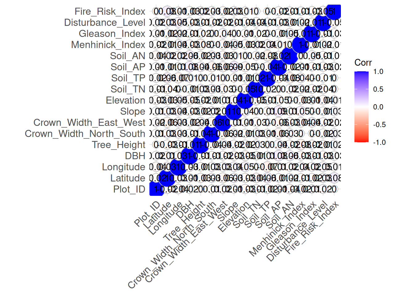
From the chart, an increase in blue shows a stronger positive linear relationship between the matching variables while increase in red shows a stronger negative linear relationship between the matching variables. White dots shows little to no relationship.
In the correlation plot(heatmap-like) it is evident that the variables have little linear relationship among each other(low correlation)
Practical Exercise
Using the downloaded co2_greenHouseGas_Emissions.csv data set determine whether there is a monotonic relationship between CO₂ emissions and total greenhouse gas emissions using Spearman’s and Kendall’s correlation coefficients.
Solution
# Load libraries
library(dplyr)
library(ggplot2)

# Load the data set and calculate pearson correlation
data <- read.csv("data/co2_greenHouseGas_Emissions.csv")

# Select the required columns
selected_df <- data %>%
  select(CO2.Emissions..Mt., Greenhouse.Gas.Emissions..Mt.)

# Convert values to numeric
selected_df$CO2.Emissions..Mt. <- as.numeric(selected_df$CO2.Emissions..Mt.)
## Warning: NAs introduced by coercion## Warning: NAs introduced by coercion# Remove null values
selected_df <- na.omit(selected_df)
# Compute Spearman's correlation
spearman_corr <- cor(selected_df$CO2.Emissions..Mt., selected_df$Greenhouse.Gas.Emissions..Mt., method = "spearman")
# Compute Kendall's correlation
kendall_corr <- cor(selected_df$CO2.Emissions..Mt., selected_df$Greenhouse.Gas.Emissions..Mt., method = "kendall")
# Print correlation results
print(paste("Spearman's Correlation Coefficient:", round(spearman_corr, 3)))## [1] "Spearman's Correlation Coefficient: 0.583"## [1] "Kendall's Correlation Coefficient: 0.546"# Visualize the relationship using scatter plot with log scale
ggplot(selected_df, aes(x = CO2.Emissions..Mt., y = Greenhouse.Gas.Emissions..Mt.)) +
geom_point(color = "blue") +
labs(title = "Relationship Between CO₂ Emissions and GreenHouse Gases Emissions",
x = "CO₂ Emissions (Million Metric Tons)",
y = "Total GreenHouse Gases Emissions (Million Metric Tons)") +
theme_minimal()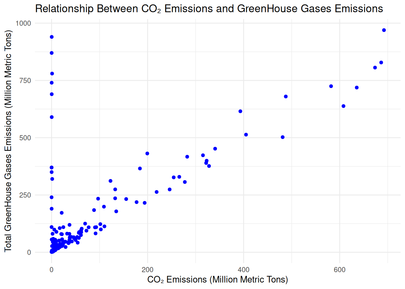
________________________________________________________________________________
4.3 COVARIANCE
—- Remember to add content on Covariance —————-
Try it!
Still using the forest_data used in the examples above. We will find the covariance between the trees’ diameter at breast height (DBH) and the Soil Nuitrients which is affected by the available phosphorous in the Soil(Soil_AP).
Remember that Covariance measures how two variables vary together but is scale-dependent.
# Compute covariance
covariance_value <- cov(forest_data$DBH, forest_data$Soil_AP, use = "complete.obs")
print(covariance_value)
## [1] 0.3007336The covariance is positive which indicates that increase in available phosphorous, Soil_AP(Soil Nutrients) has an influence in the Diameter at breast height, DBH.
Practical Exercise
Solution
________________________________________________________________________________
4.4 GEOSTATISTICS
Geostatistics is a specialized branch of statistics focused on analyzing and estimating spatially correlated data. It is widely used in fields such as ecology, geology, and environmental science to predict values at unsampled locations based on the spatial relationships observed in sampled data.
A geostatistical analysis typically unfolds in two main steps: variogram modeling and kriging. Together, these steps help estimate unknown values and assess the precision of those estimates, enabling informed decision-making in spatial studies.
Lets introduce each of them will break down later with live examples
4.4.1 Variogram Modelling
The first step in geostatistical analysis involves developing a model to describe the spatial relationships between sampled and unsampled locations. This model is known as a variogram or semivariogram.
Here are the some of key features of the Variogram:
- The variogram quantifies how measurements at nearby locations are more similar (or correlated) than those farther apart..
- It incorporates assumptions about the spatial structure of the data, considering known site characteristics and potential spatial trends.
A variogram can be used n a study of soil nutrient distribution across a forest, the variogram might reveal that nutrient concentrations are strongly correlated within a radius of 50 meters but weaken beyond that distance.
———————Expand on this———————-(content from the book)
4.4.2 Kriging
Kriging is a powerful geostatistical technique used to interpolate unknown values at unsampled locations based on spatially correlated data. It is widely applied in ecology for predicting environmental variables such as pollution levels, soil properties, biodiversity distribution, and climate patterns.
Once the variogram is established, the second step—kriging—is performed to estimate unknown measurements at unsampled locations.
This is how kriging works:
Measurements at surrounding sampled locations contribute to the estimate at the unsampled point.
Weights are determined based on the variogram model, the location being estimated, and the distance of nearby sampled points.
Kriging provides not only an estimate of the unknown value but also an estimate of precision, known as the kriging variance.
The precision depends on the variability in the surrounding data.
… and this how the accuracy and precision of kriging can be improved;
- Increasing the number of sampled locations enhances the accuracy and precision of kriging estimates.
- Kriging outputs are often used to create data contours or isopleths, which provide a visual representation of spatial variation across the study area.
Kriging might be used to predict plant species richness across an unsampled landscape, leveraging data from sampled plots to generate a continuous map of biodiversity.
Try it! Lets predict Soil Nitrogen Levels
Lets take a scenario where a conservation scientist is studying soil nitrogen concentration across a forest. However, measuring nitrogen at every location is impractical due to cost and time constraints. Instead, kriging can be used to interpolate soil nitrogen levels at unsampled locations, helping identify nutrient-deficient areas and inform conservation strategies.